Cohort Analysis is an extremely powerful technique that all online retailers can use to understand behavioral patterns in their customer base. Let’s take a look at a few of its applications in eCommerce, and at how to perform one with Google Analytics and MySQL + Excel.
The basics:
Cohort Analysis is a longitudinal study technique that allows to spot behavioral patterns across different groups of people called cohorts. Cohorts are identified by the different timeframes in which their members shared a common experience. The main idea behind cohort analysis is to group people who made the same experience, but at different points in time, in order to compare their behavior at similar points in their life cycles.
Let’s look at all the couples who got married in Berlin in 2000. This group is a cohort, because every couple (we will consider each couple as one cohort member) shares a common experience – getting married – and has done it in the same time span – the year 2000.
If we were to count how many of these couples were still married in the following years, we’d find a naturally declining pattern. But has this pattern always existed? And to this extent? By grouping couples by the year of marriage, we are able to assess how closely cohorts behave in the following years. Let’s compare for example the 2000 cohort with the 1972 one:
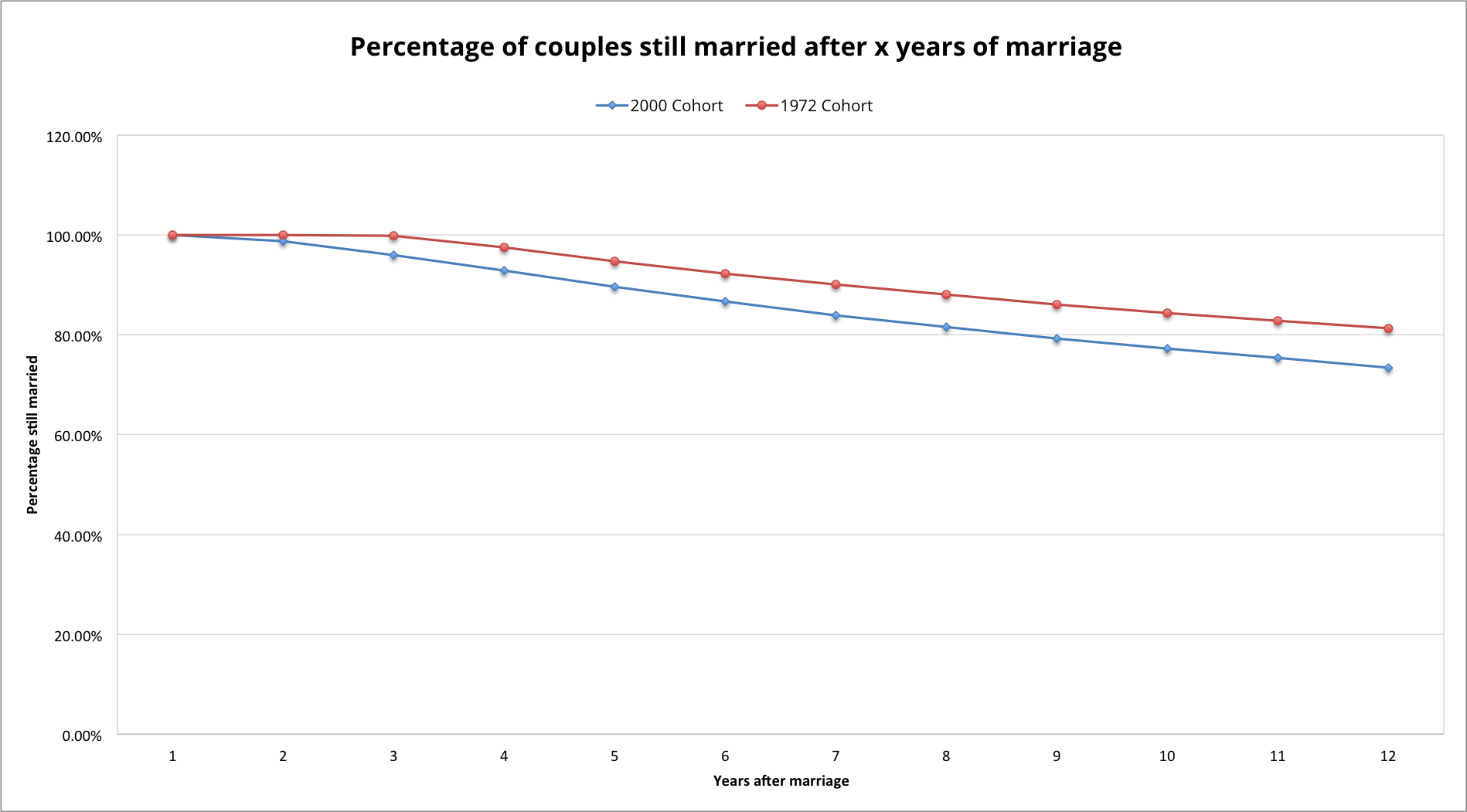
In the chart, the y axis represents the percentage of couples still married, while the x axis represents the year in the lifecycle for each cohort, e.g. x=2 means 2002 for the 2000 cohort and 1974 for the 1972 cohort. Both curves show a similar downward trend. The 1972 cohort though, starts its decline only at the 4th anniversary. What could explain this difference in behavior? Something has happened, and we now know when. This will prompt us to investigate and find out that in fact, a marriage reform was introduced in Germany in 1976, allowing for an easier divorce process. This could explain the behavior change.
Cohort analysis for eCommerce:
In eCommerce, cohorts are usually defined by the first time an user registers to, or makes their first purchase through the website. By comparing the behavior of users who came in contact with our product at different points in time, we can isolate and assess the efficacy of our product or marketing improvements. For example, if the customers we acquired in May 2014, show particularly good loyalty in subsequent months, compared to the ones acquired in January 2014, it might signal that the marketing mix we applied in May was appropriate and effective. Let’s look at some of the most important applications of cohort analysis for eCommerce.
1. Visualizing customer retention and churn
Subscription based online business, much akin our marriage example, will naturally have to cope with customer churn. The main analysis issue tackled by cohort analysis is that, especially when growing at a fast pace, customer acquisition can overshadow retention and engagement problems. When looking at the aggregate count of customers, interactions or revenues, we might feel reassured by upward trends, although in fact we might be dealing with a leaky bucket in which we happen to pour more water than it escapes.
Let’s look at a practical example. To examine our customer retention we count how many users subscribed to our service in the past months, and keep track of how many of them still are in the following ones.

In January, 184 new clients signed up. At the end of the month, all of them were still signed up, but at the end of February only 125 remained. The table’s color code helps to point out two opposed trends: an horizontal, declining one that represents churn, a vertical one representing the growth in monthly acquisitions. Note that as opposed to our basic initial example with divorce rate, we are also tracking how many members of the cohort survive at the end of period 1. This is important because the factors responsible for a user churning immediately after subscription might be very different from the ones causing them to churn at the second month of their lifecycle.
At this point, we still aren’t able to tell whether our user retention has gotten better or worse over time, due to the effect of growth in customer acquisition. For a more meaningful comparison let’s normalize each cohort dividing it by the number of its original members.

Patterns are now more evident. Although we have been acquiring more customers, from august onwards a larger share of them churned immediately. This might signal that our acquisition strategies were effective in bringing more customers in, but that they were relatively less interested in the product. We notice instead that the june cohort had particularly good retention over subsequent periods. This can signal that the marketing efforts in that month proven to be particularly effective, and should be investigated and possibly replicated.
2. Assessing the value of customers
Are the customers we are acquiring now as valuable or as predictable in their spending as the ones of previous cohorts? How much should we spend to acquire a new customer, and when can we expect acquisition costs to be paid back? Cohort analysis can answer those questions, showing how to acquire more valuable customers, and providing us with a top-limit for acquisition spending.
Let’s segment our customers in cohorts based on the month of first purchase, and track how much revenue cohort members generate on average during their lifetime. We use an average, again to remove the effect growth in customer base. By dividing total revenues generated by all cohort members by the size of the cohort, we can isolate the the average value of each customer.

The cumulative nature of the data makes the table more difficult to read than the previous examples. Plotting our values in a chart might help us spot more subtle trends.
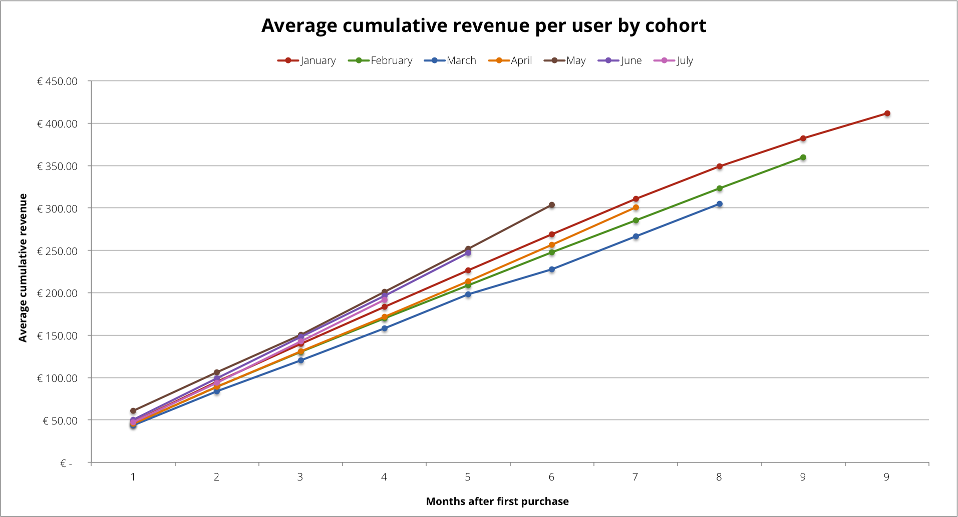
The chart does a better job at showing that some cohorts delivered more value over time than others. In particular we can notice how the customers we acquired between January and March, brought progressively less value to our company. From April onwards, instead, the tendency starts to be reversed. In May, in particular, the right marketing mix seems to have been applied to acquire the most valuable customers so far. This can trigger us to review what has worked so well in May to apply those strategies again.
3. Assessing the value of different acquisition sources
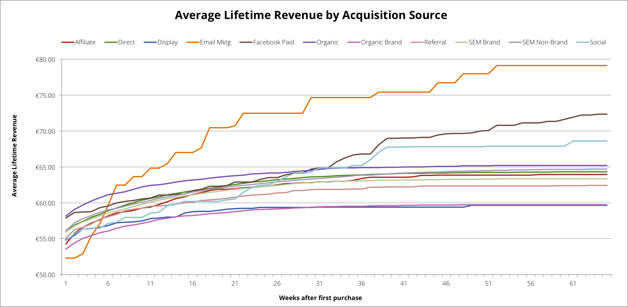
It might be interesting for us to compare how customers acquired through different channels behave in subsequent months. Are customers acquired through facebook more loyal than the ones acquired through twitter? Do customers who found organic search spend more than ones who clicked on an ad? Here we start to do things a bit differently, conceptually. We always group customers by their first contact with the company, be it a purchase or a subscription to the service, but we create a cohort for each channel instead of each registration period. Below is an application which shows the average lifetime revenue of a member of each acquisition channel cohort. We can see that some channels, like email, Facebook paid and Social, are particularly good to attract customers who engage in repeat purchase, and whose lifetime revenue increases with time. The curves also show at which point in we would recover our customer acquisition spending: for example, if the CAC for a customer through Facebook ads is €60, we could recover the cost in roughly 7weeks (it would be more appropriate to perform this analysis with average lifetime gross profit, excluding COGS).
4. Forecasting
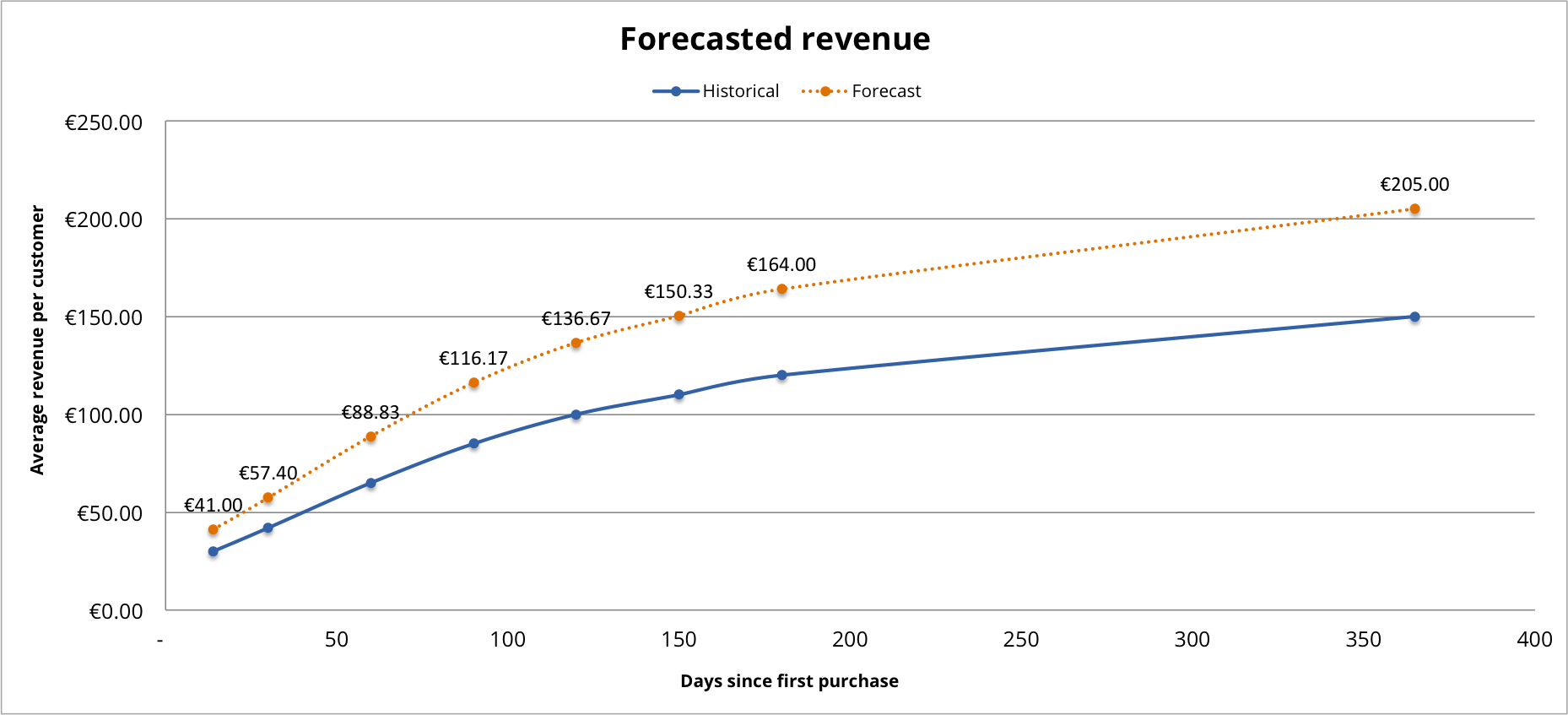
In the examples so far, we’ve seen that each cohort implicitly behaves in an unique way, as it is composed by different customers, who came in contact with our services at different points in time. Once we assess their behavior though, each cohort can be used to reasonably forecast the behavior of similar but entirely new customers. Below is an application of a cohort based forecast. In blue, we have the observed average revenue per customer over a year. This group could be any single cohort we select to be a representative model for the behavior of our new group of customers. They could share some attributes, like being acquired through the same channel, or having purchased the same fist product, etc. The yellow dotted line is the projection based only on the observed average revenue at 15 days after purchase.
Performing your own cohort analysis
We have seen some great uses of cohort analysis. But how does one go about performing one? Where can i get the data? Let’s perform one step by step using the most common – although laborious – method, SQL + Excel, and then see what we can achieve with Google Analytics. For your convenience we have created an Excel model that you can use as a guide, and as basis to perform your own cohort analyses.
Fill in the details to get a free Excel model to perform your own cohort analysis delivered to your mail.
1. Cohort Analysis with MySQL + Excel
If you have an online shop, the data you need is likely sitting in your transactional database. A relatively simple SQL query will suffice to get all the data we need. Below is an example query to perform a cohort analysis of customer retention, and customer value:

The exact query will vary depending on your specific database configuration, but it will be similar to the one above. What we are asking MySQL is for a table that includes:
- a customer ID, of which there will be as many instances as many orders placed by all customers.
- the transaction amount (in the example we also ask for Gross Profit by subtracting COGS from the subtotal).
- the date of the transaction. In this case we are interested in the month of transaction, but any date or time can be used, up to minutes and seconds.
- the cohort where each user belongs. To obtain it we ask SQL to take the earliest date each customer ID has appeared, and return it as cohort date for that ID.
Additional dimensions are always welcome as they will allow us to filter the results for a more detailed analysis. Here, we also pulled the channel each customer was acquired through. The result of the query will look like this:
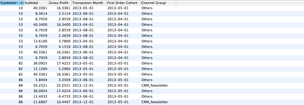
We are now ready to import this data into Excel for calculation. Once everything is imported, your spreadsheet should look something like this:
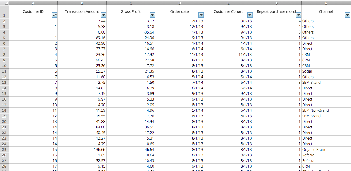
You will notice that the Repeat purchase month column in the table above was not pulled directly from the database. Rather, it was calculated in Excel in order to associate each repeat purchase to a specific month in the customer’s life cycle.
For example, customer ID 1 first purchased in September 2013, and is therefore a member of the September cohort. Their second order was placed in November 2013, three months after their first purchase, or in the 3rd month of their life cycle. To easily calculate this value in Excel, we can use the formula below:

At this point, we want to summarize this data in a table, grouping all users in the respective cohorts, and summing their respective spending in each month following the first order. To to this we create a Pivot Table.
Let’s click on Data > Analysis > Pivot Table > Create manual pivot table (naming might slightly differ according to your version of Office, this walkthrough was made on Office for Mac 2011).
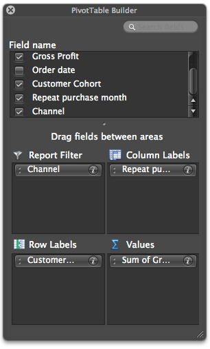
Let’s select the whole table as a range, and make sure to include column headers: Excel will recognize them as field names for the Pivot Table. We will be prompted to select the fields we want to use to group data and which operation to perform. To the right, you can see a screenshot of the Pivot Table builder: we want rows to group customers by cohort, while columns to group orders by month of repeat purchase. In the values field, we want to perform a sum of all gross profits pertaining to each cohort at each month following the first purchase. As a plus, we will use channel as a report filter.
Here is the resulting Pivot Table (color emphasis added later):
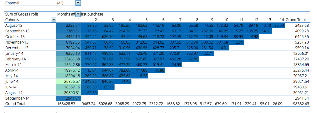
The Pivot Table should now look familiar. Each cell shows the sum of gross profits that members of cohort y produced in month x. The color formatting, due to the great variation between the values, makes the table hard to interpret. At first glance we can only notice that gross profits have grown steadily from August 2013 onwards. Plotting these points in a chart will help us interpreting the data.
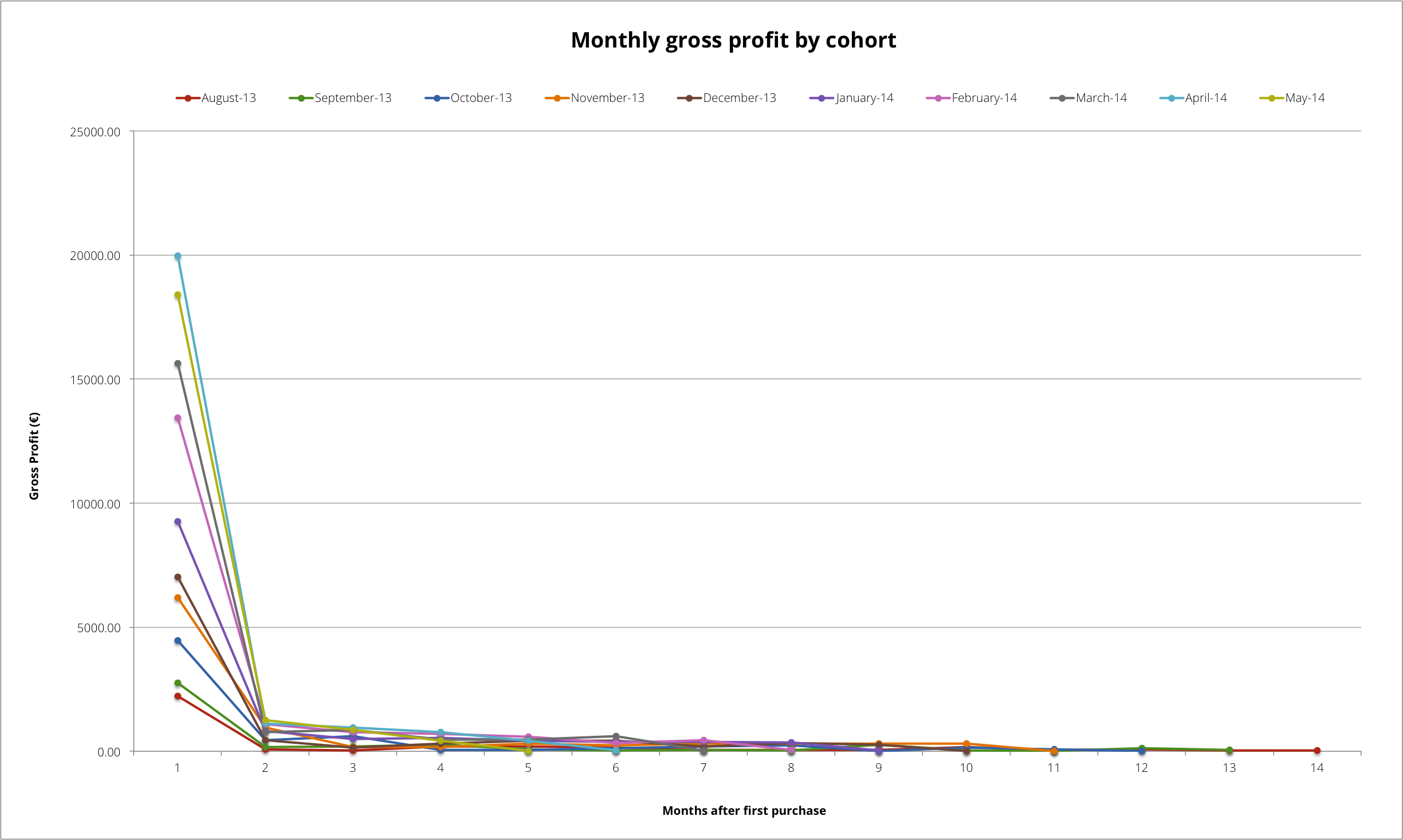
As suspected, although our gross profits have been growing steadily, repeat purchase is extremely low. This, depending on the type of product offered, might be a very alarming sign. To explore further, let’s only consider repeat orders for each cohort. A column chart can be another useful type of visualization:
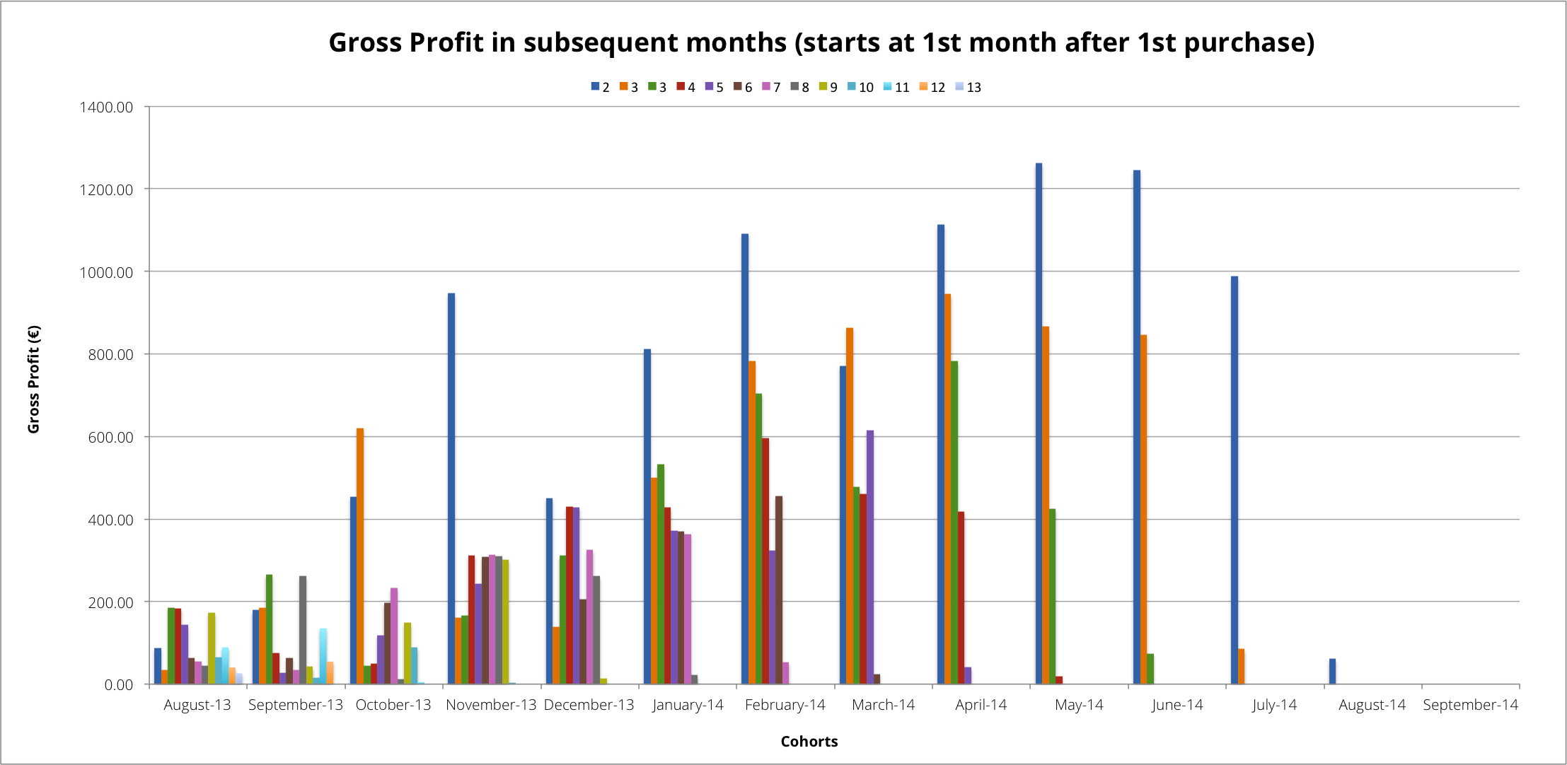
The column chart is a slightly more reassuring, showing that from December 2013 on, customers who purchased again in the 2nd month, tend to come back again in the following. Gross profit for the 2nd 3rd 4th months also seems to rise along with more recent cohorts. Another interesting fact is that the March 2014 cohort, generated more revenues in their 5th lifecycle month than their 3rd and 4th. This could be an interesting insight to explore further: maybe a reactivation campaign has worked particularly well? Or simply the natural lifecycle of the product brings customers back for accessories, cartridges or substitutes?
The analysis shows that many customers never come back at the first purchase, but those who do, tend to stay with us. The company needs to put more efforts in encouraging second purchase.
Fill in the details to get a free Excel model to perform your own cohort analysis delivered to your mail.
2. Cohort Analysis with Google Analytics
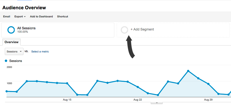
Although cohort analysis is not a native feature in Google Analytics, since 2013, our favorite web tracking tool offers user based segmentation. This means we can effectively group users into cohorts based on their first visit to the site, by creating advanced segment for each cohort, and selecting different date ranges in order to collect data on their behavior in the following months. To create an advanced segment, follow the standard procedure: click on Add Segment > New Segment.
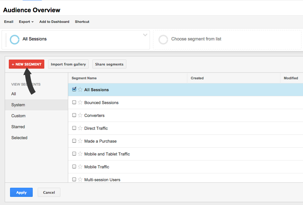
Let’s name the segment accordingly, and click on the Date of First Section option in the segmentation menu. Here we will be able to select a starting and an end point (depending on the type of analysis needed, weekly or even daily cohorts can be created). As is, this cohort will group all unique users who had their first session on site during the timespan selected. If we want to group users based on their first purchase or the accomplishment of a goal, we can add some conditions in the Ecommerce and Conditions sections.
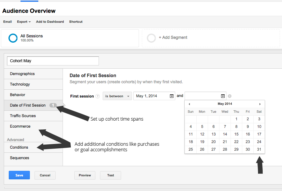
When finished let’s click save, and repeat the process for every single cohort, changing the time span in the Date of First Session menu accordingly. Once cohort segments are created we can apply them (to a maximum of four at a time) to any report. In this example we are going to apply them to the Audience Overview report, to gain some insights on user retention.
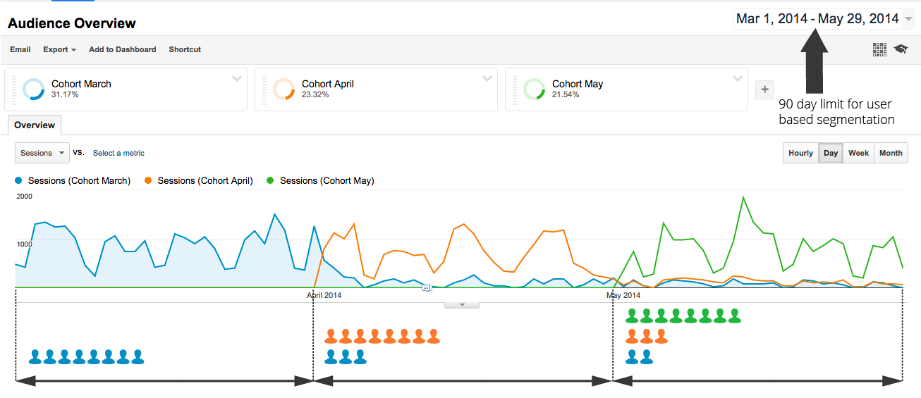
Notice that, that the date range only includes three months of data. This is the limit set by Google when working with user based segmentation. Although making our data collection more laborious, it will not prevent us from performing a cohort analysis for a period that exceeds three months.
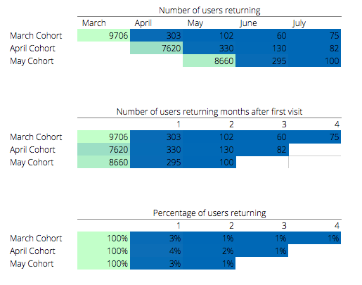
In the report, we are now looking at all the users who had their first session in either March, April or May. In order to get the precise count of returning users for each cohorts, we will select a single month at a time in the date range, and take a note of the metric we are interested in. In the picture below we track the number of unique users by cohort, visiting our website each month from March to July.

We now have the data we need to calculate retention rates. Let’s plug the data in a spreadsheet and calculate the percentage of users returning in the months following first visit. As we see, there is great margin for improvement, of all users, only 3-4% come back in the second month, and the percentage stabilizes at 1%.
Conclusions
In this post we have gone through only a sample of the wide array of applications of cohort analysis. We have learned how to gather the data we need, and to perform one in Excel or Google Analytics.
Although very insightful and relatively straightforward in execution, you have probably noticed that cohort analyses is very labour intensive. This is why we created a tool like Wunderdata to do perform it automatically. We selected the most useful cohorts analysis based on the best practices in eCommerce, and provide them in our dashboards, working straight out of the box.
Fill in the details to get a free Excel model to perform your own cohort analysis delivered to your mail.
